This version of the form is not currently in use and is provided for reference only. Download this version of
the document
for the current year.
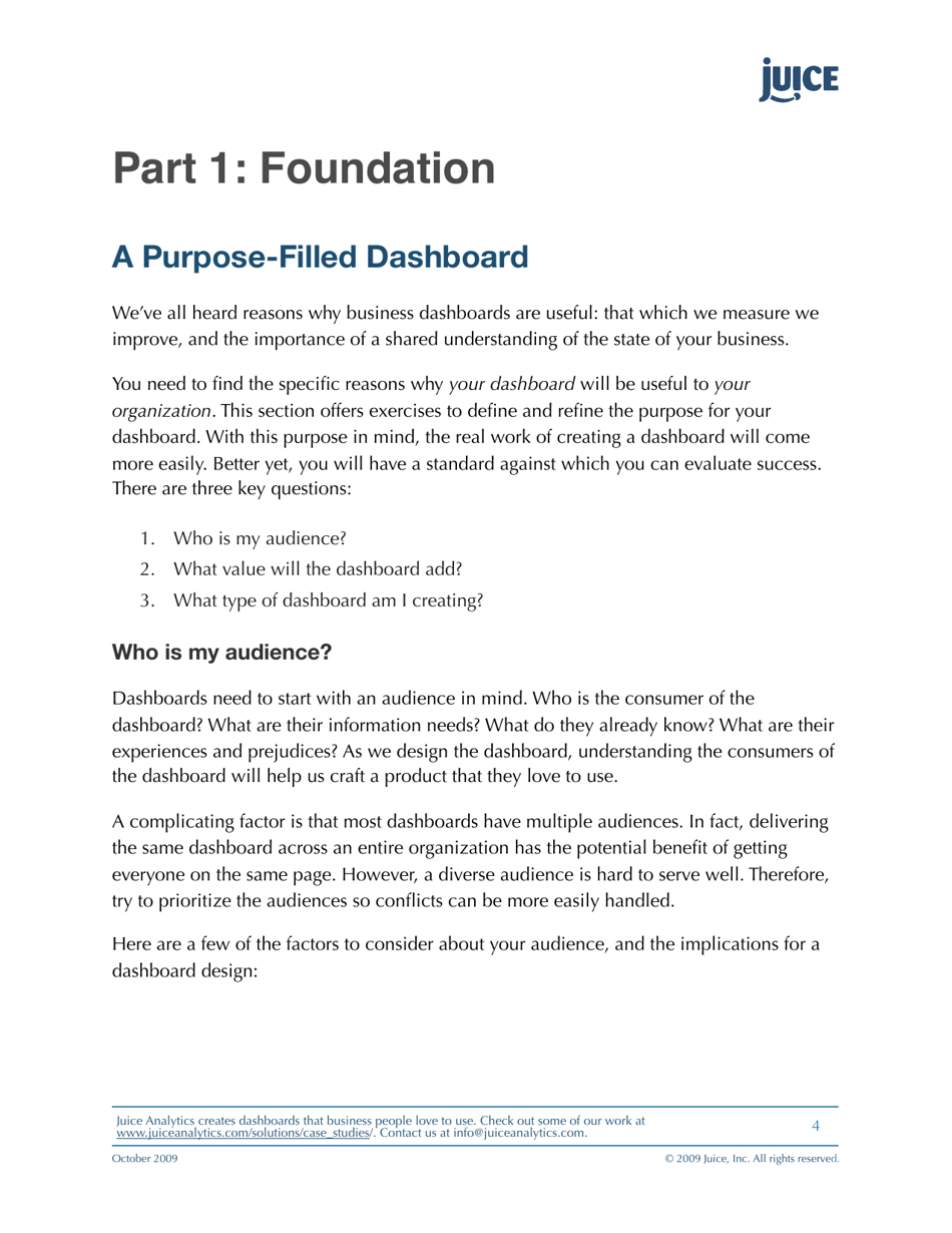
A Guide to Creating Dashboards People Love to Use - Juice Analytics
"A Guide to Creating Dashboards People Love to Use - Juice Analytics" is a resource that provides guidance and tips on designing effective and user-friendly dashboards. It aims to help individuals and businesses create data visualization tools that are visually engaging, easy to understand, and enjoyable to use.
Juice Analytics is the company that created and published the document "A Guide to Creating Dashboards People Love to Use."
FAQ
Q: Why is creating a dashboard important?
A: Creating a dashboard is important because it allows you to present data and information in a visually appealing and easy-to-understand manner. This helps users quickly analyze and interpret complex data, leading to better decision-making.
Q: What are some key elements of a good dashboard?
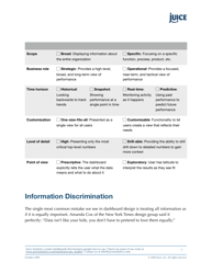
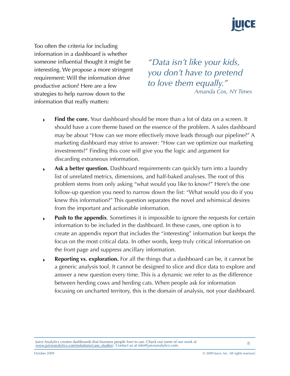
A: Some key elements of a good dashboard include: clear and concise data visualization, relevant and actionable metrics, intuitive navigation and interactivity, and customization options for individual users.
Q: How can I make my dashboard visually appealing?
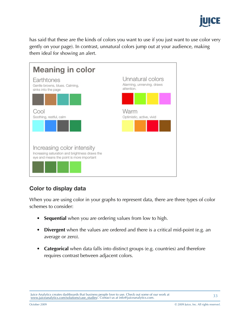
A: To make your dashboard visually appealing, use a consistent color scheme, choose appropriate fonts and font sizes, and include eye-catching data visualizations such as charts and graphs. Avoid clutter and ensure that the layout is clean and organized.
Q: What are some best practices for designing a dashboard?
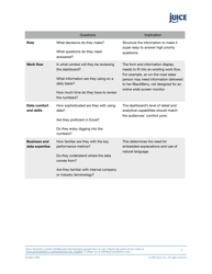
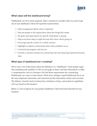
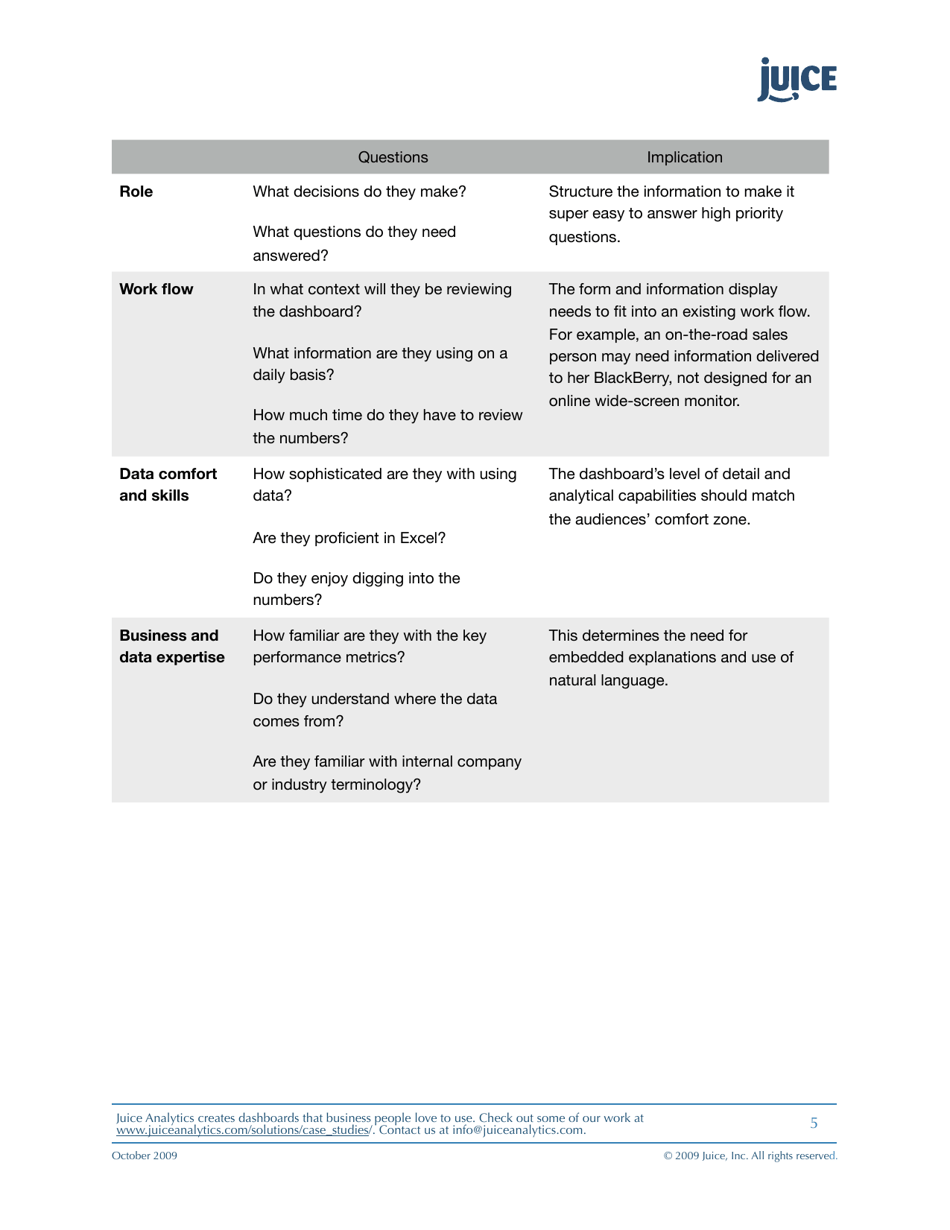
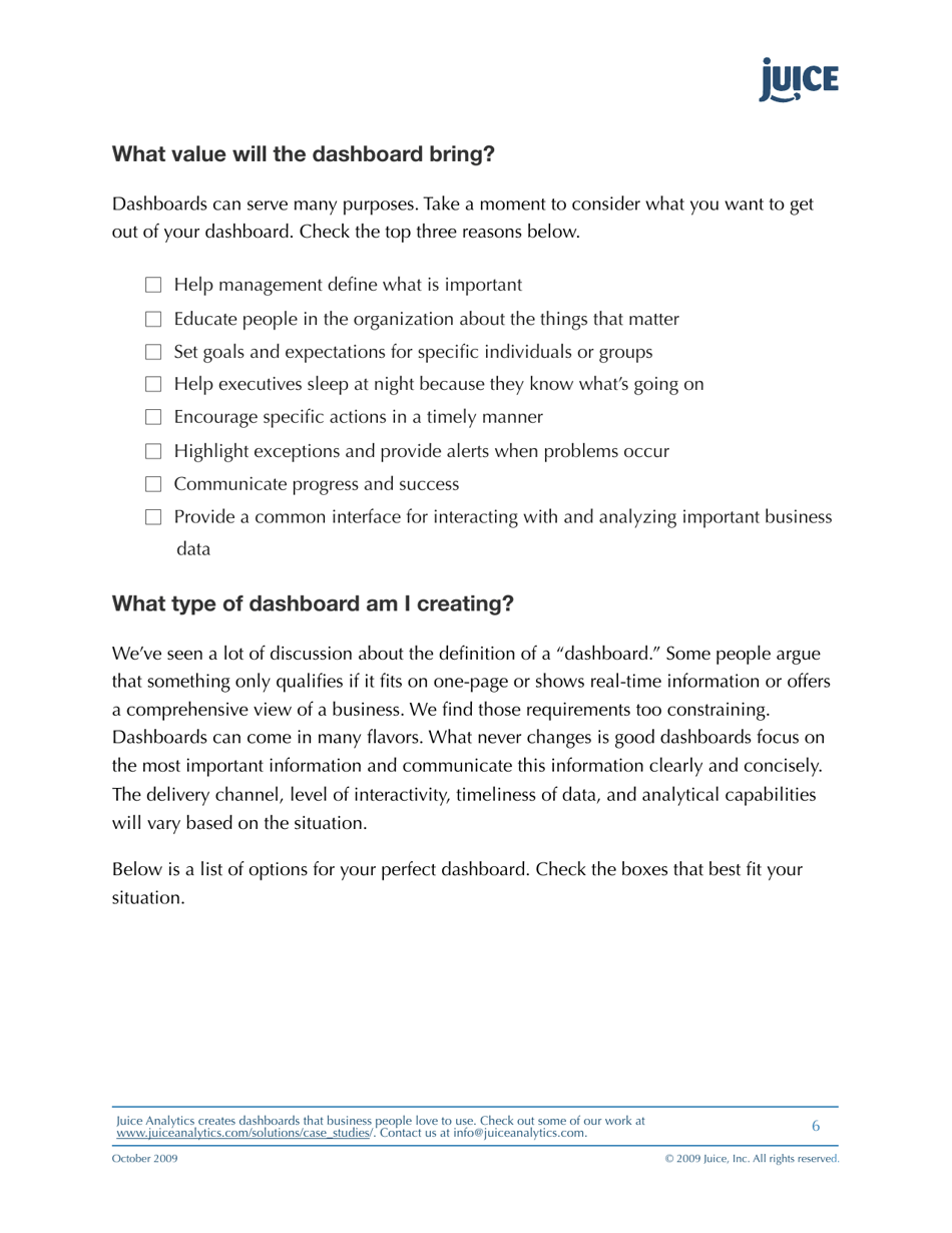
A: Some best practices for designing a dashboard include: defining the purpose and target audience, prioritizing the most important metrics, using meaningful and descriptive labels, providing context for the data, and testing the dashboard with potential users for feedback.
Q: How can I ensure that users find my dashboard easy to use?
A: To ensure that users find your dashboard easy to use, keep the layout simple and intuitive, provide clear instructions and tooltips, offer editable views and filters, and regularly gather user feedback to identify any pain points or areas for improvement.
Q: What are some common mistakes to avoid when creating a dashboard?
A: Some common mistakes to avoid when creating a dashboard include: cluttering the dashboard with excessive information, using overly complex or confusing visualizations, not considering mobile responsiveness, and neglecting to regularly update and maintain the dashboard.
Q: How can I measure the success of my dashboard?
A: To measure the success of your dashboard, track key performance indicators (KPIs) such as user engagement, time spent on the dashboard, and completion of desired actions. You can also gather user feedback through surveys or interviews to understand user satisfaction and identify areas for improvement.
Q: What tools are available for creating dashboards?
A: There are several tools available for creating dashboards, including popular ones like Tableau, Power BI, Google Data Studio, and Excel. These tools offer a range of features and capabilities to design, customize, and share interactive dashboards.
